
In 1960, Valley of the Dolls by Jacqueline Susann revolutionized the publishing industry with its provocative cover featuring stylized pills against a stark background. The bold design choice, controversial for its time, helped propel the novel to sell over thirty million copies.
This success crystallized what publishers had long suspected: despite the age-old adage warning against it, readers do judge books by their covers. Modern publishing data reinforces this truth - according to the Book Industry Study Group's 2022 report, cover design ranks as the second most influential factor in book purchases, surpassed only by author name recognition.
While book jackets emerged as pragmatic protectors; however, with time, their purpose evolved. They became canvases for art, storytelling, commerce and intrigue, first sparking curiosity in elite literary circles, then branching out to the wider reading public.
We found ourselves captivated by the thought of what this art will hold for the digital age. What follows is a synthesis of our internal discussion around the holiday dinner table.
Origins as a shield and a stage
There was a time when books were precious, hand-bound items — luxuries often enshrined in leather or other durable materials. These bindings, embellished with gilt lettering or intricate embossing, were designed to last and impress. For centuries, books were as much status symbols as they were repositories of knowledge, owning a finely bound book spoke to one’s education, wealth, and taste.
The printing press, invented by Johannes Gutenberg in the mid-fifteenth century, revolutionized this landscape. Publishers began producing books in greater numbers, making them accessible to a growing literate middle class. Still, the craftsmanship of bindings persisted, with woodcuts and engravings gracing the pages within.
Academic books, in particular, carried a sense of gravitas. The covers were often unadorned, emphasizing the content over decoration. They conjure images of grand libraries (think of Trinity College Dublin), where scholars pore over tomes of Aristotle or Copernicus, their somber leather covers whispering intellectual rigor.
By the nineteenth century, publishers recognized the need to differentiate their offerings, especially as booksellers began stocking shelves with competing titles. Enter the dust jacket—a paper sleeve that is wrapped around a book, initially to protect it during transport but soon to act as a stage for visual storytelling.
As books evolved from precious artifacts to mass-produced items, their covers underwent a parallel transformation. While the craftsmanship of traditional bindings spoke to permanence and prestige, a new innovation would soon revolutionize how readers interacted with books. The humble dust jacket, originally conceived as mere protection, would become the publishing industry's most powerful marketing canvas.
Dust jackets and paperbacks
The first known dust jacket, created in 1829 for Thomas Carlyle’s Sartor Resartus, was plain and unremarkable. But by the late nineteenth century, publishers realized the jacket’s potential as a marketing tool. This shift was spearheaded by figures like George Routledge, founder of Routledge & Sons, who believed in making books more visually appealing to attract buyers.
With the advent of illustrated dust jackets, books gained a new dimension of appeal. Artists like Aubrey Beardsley, associated with Oscar Wilde’s works, brought an aesthetic that blended decadence with mystery. The book jacket became a site of collaboration between publishers, authors, and designers—a delicate balance of commerce and creativity.
If you think no business survives an economic downturn, think again. Allen Lane, the founder of Penguin Books, pioneered the paperback format at the height of the Great Depression. His mission was simple: to bring quality literature to the masses at an affordable price, as Gutenberg did hundreds of years before him. Penguin’s color-coded covers — orange for fiction, green for crime, blue for biography — were revolutionary in their simplicity.
Albatross Books, a German precursor to Penguin, had laid the groundwork with similar innovations in the 1930s. Their sleek, modern designs and focus on genre differentiation inspired Lane. Together, these publishers democratized reading, creating a new era where books were no longer just for the elite.
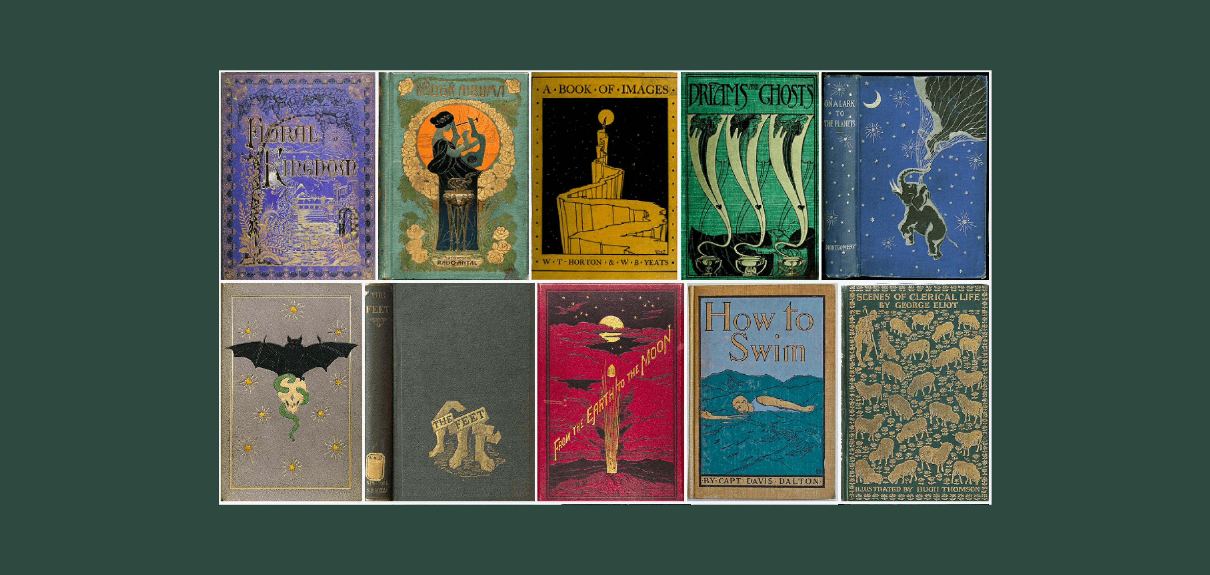
Design timeline
In their infancy, book jackets were monochromatic and utilitarian. Publishers used minimalistic designs to convey seriousness and reliability. Typography dominated, with large block letters or Gothic scripts evoking authority.
By the 1920s and 1930s, modernism had taken hold. Some Bauhaus designers who left Germany ahead of WWII worked for Penguin and other print houses, emphasizing clean lines, asymmetry, and sans-serif typefaces.
Dutch graphic designers, such as Piet Zwart, expanded on these principles, creating dynamic layouts that played with geometry and color. Modernist book jackets reflected a world in flux—industrial, experimental, and forward-looking.
Postwar design opened the floodgates to global inspiration. Japanese aesthetics, with their understated elegance, began influencing Western book covers. Japanese woodblock prints, such as those by Katsushika Hokusai, provided a foundation for this approach, influencing both color palettes and compositional balance.
Middle Eastern influences brought a vibrant rhythm to book jacket design, particularly in the realms of poetry and spiritual texts. Arabic calligraphy, with its flowing, sinuous forms, became a hallmark of covers for Middle Eastern and South Asian literature. Publishers like Saqi Books have consistently used intricate patterns and vibrant colors inspired by Islamic art, elevating the covers to a level of ornamental beauty rarely seen in Western designs.
One striking example is the cover of Naguib Mahfouz’s Palace Walk, which blends traditional motifs with modern typography. The use of geometric patterns and earthy tones captures the essence of the Nobel laureate’s Cairo Trilogy, connecting the reader to the cultural and historical roots of the narrative.
The Cold War era, with its undercurrents of tension and secrecy, left its mark on design. Book jackets of the 1950s and 1960s often featured stark contrasts—bold reds, blacks, and whites—alongside abstract imagery. Thrillers and political novels embraced cryptic designs that played on the paranoia of the age.
Psychedelic patterns, hand-drawn illustrations, and experimental typography dominated the 70s. Works of poetry and literature from the Beat Generation often carried ethereal, nature-inspired designs, emphasizing introspection and freedom.
The late twentieth century brought a postmodern sensibility to book jackets. Designers like Chip Kidd embraced irony, layering textures and visuals in unexpected ways. Kidd’s cover for Michael Crichton’s Jurassic Park, with its stark dinosaur skeleton, became an instant classic, embodying the idea that less is more.
Peter Mendelsund's cover for Stieg Larsson's 'The Girl with the Dragon Tattoo', in the first decade of the new millennium, established a new visual ‘Scandinavian Noir’ language for thriller novels, with its stark neon typography against a high-contrast background inspiring countless imitations.
Aesthetics of different countries
Tracing how book covers evolved across time is only one vantage point. We can also trace it according to a country’s literary canon. A country’s relationship to writing profoundly shapes the design of its book covers, reflecting its cultural traditions, historical narratives, and aesthetic sensibilities.
Take, for example, Brazil. Its literary history, particularly its modernist movements and postcolonial themes, plays a central role in its cover art. Writers like Machado de Assis and Clarice Lispector explored identity, existentialism, and societal shifts, inspiring designs that blend tropical vibrancy with introspection.
Brazilian cover art often embraces the country’s lush, colorful landscape. Modernist traditions, spearheaded by the Semana de Arte Moderna in 1922, inform designs that feature abstract forms and bold colors. The works of Jorge Amado, for instance, are often paired with folkloric or tropical motifs, evoking the cultural and geographic richness of Bahia.
Similarly, New Zealand’s literary tradition is deeply tied to its bicultural identity, blending Māori heritage with Pākehā, or European settler, influences. The dramatic landscapes of New Zealand—its mountains, coasts, and forests—are central to the country’s cover art. Many books incorporate natural imagery as a visual metaphor for isolation, resilience, or connection to the land.
Russia’s literary canon, steeped in philosophical and existential exploration, lends itself to cover art that is brooding, symbolic, and often minimalist. Classics from Tolstoy, Dostoevsky, and Chekhov grapple with morality, despair, and societal decay, themes reflected in the austere aesthetic of Russian cover designs.
The covers for Dostoevsky’s Crime and Punishment frequently feature stark contrasts—dark backgrounds with minimalist typography or abstract imagery of fractured faces and urban decay. These designs mirror the psychological tension and philosophical depths of the text.
France’s literary heritage, encompassing the works of Victor Hugo, Marcel Proust, and Albert Camus, drives a tradition of elegant and often experimental cover art. French publishers like Gallimard have long championed minimalistic designs. The Bibliothèque de la Pléiade series is a hallmark of this approach, featuring leather-bound covers with subtle embossing and gilt lettering, emphasizing the gravitas of the text within.
Postmodern French literature, such as the works of Marguerite Duras or Michel Houellebecq, has inspired avant-garde designs. Duras’ The Lover often features ethereal, impressionistic covers that mirror the text’s lyrical style and emotional depth.
Parallels to album art
Album covers, similar to books, are strong cultural statements and sites of commercial intrigue. Designers like Storm Thorgerson (Pink Floyd’s Dark Side of the Moon) and Peter Blake (The Beatles’ Sgt. Pepper’s Lonely Hearts Club Band) created covers that were as iconic as the music itself. Similarly, book jackets of the time, such as those for J.D. Salinger’s The Catcher in the Rye, achieved a similar status.
The underwater image of a baby chasing a dollar bill, photographed by Kirk Weddle, is iconic for its provocative simplicity and cultural critique. Nirvana’s Nevermind’s cover reflects themes of innocence, commodification, and disillusionment.
In the realm of electronic music, album art is particularly important. Vinyl sleeves, like book jackets, must condense a sensory experience into a single, evocative image. Rødhåd’s Anxious sleeve art uses a minimalist palette of gray and black to convey a brooding, industrial atmosphere. This aesthetic resonates with the darker themes of techno music while maintaining a modernist sensibility.
Where we go from here
We are creatures who crave beauty, and we let that craving guide us in ways we rarely acknowledge. A 2019 Nielsen survey revealed that fifty-six percent of book buyers cited cover design as the primary factor in their decision to purchase a book. Among debut authors, where name recognition is non-existent, this figure leaps to nearly ninety percent.
As reading increasingly moves to digital platforms, the role of the book jacket is going to adapt.
Designers face the challenge of distilling their work into this constrained format while still capturing the essence of the book.
On e-readers and online storefronts, the cover exists as a thumbnail. While once books competed for attention on the shelves of libraries or bookstores, a tiny square as a thumbnail in an app must perform the same function.
Depending on where you buy your books, some today come with QR codes – opening the door to augmented reality (AR). AR could transform static covers into interactive experiences. A phone’s camera might reveal hidden animations or trailers, adding layers of storytelling to the jacket. This is similar to behind the scenes and extras that come with DVDs.
Despite technological shifts, the essence of the book jacket remains unchanged. It must captivate and communicate while honoring the story within. Brilliant designers will continue to draw from art, culture, and technology to create covers that stand the test of time, and we hope that new tools open, rather than restrict, their possibilities.
Thank you wholeheartedly for reading till the end.